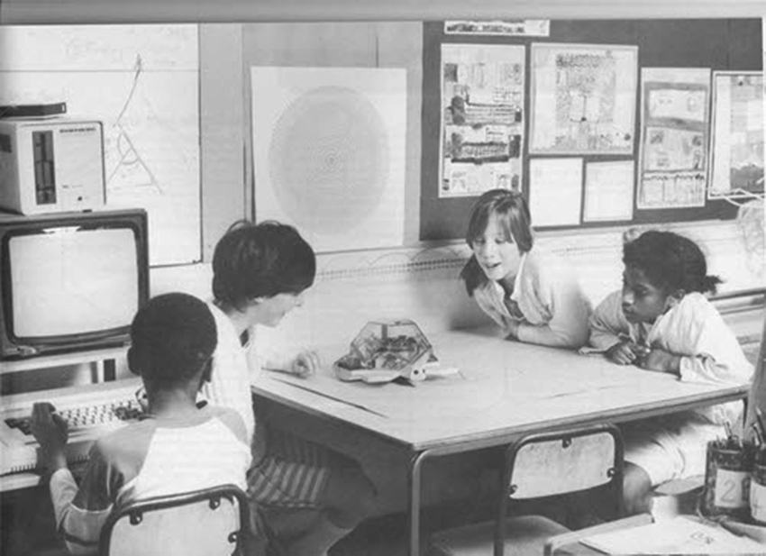
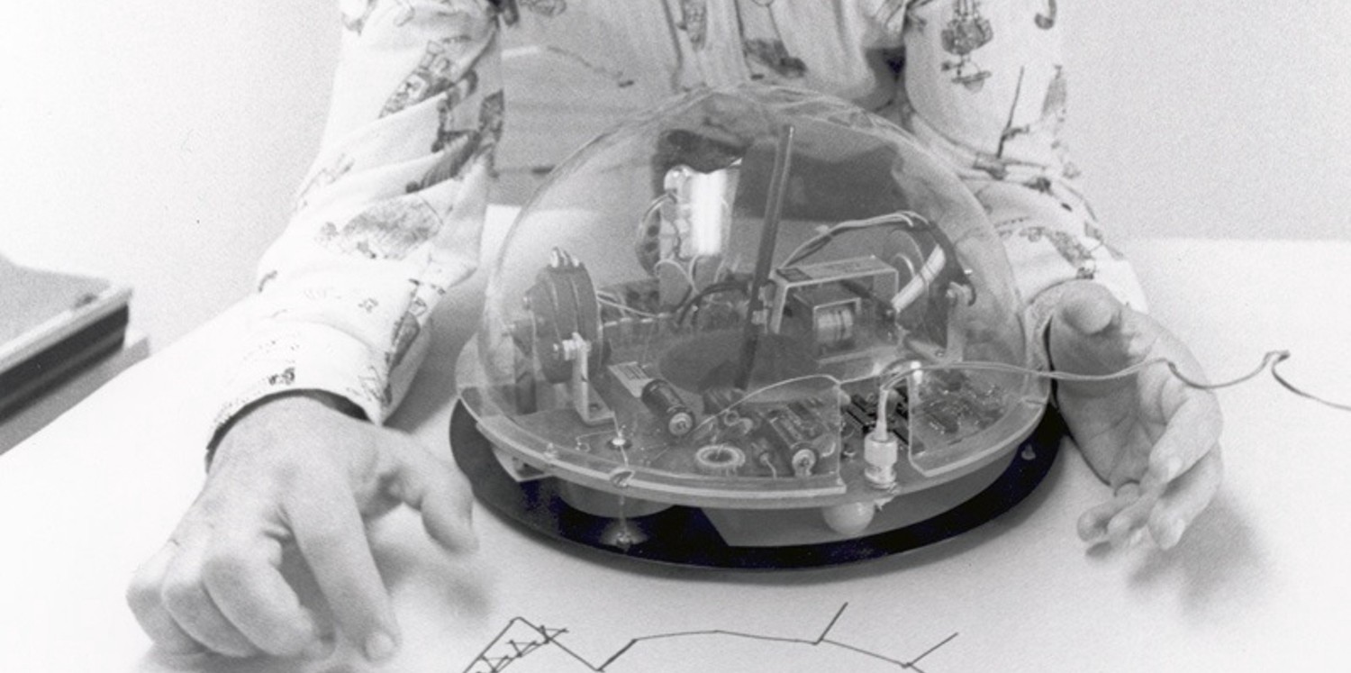
 LOGO, the turtle programming project by Seymour Papert, Wally Feurzig and Cynthia Solomon. Image © Logo Foundation
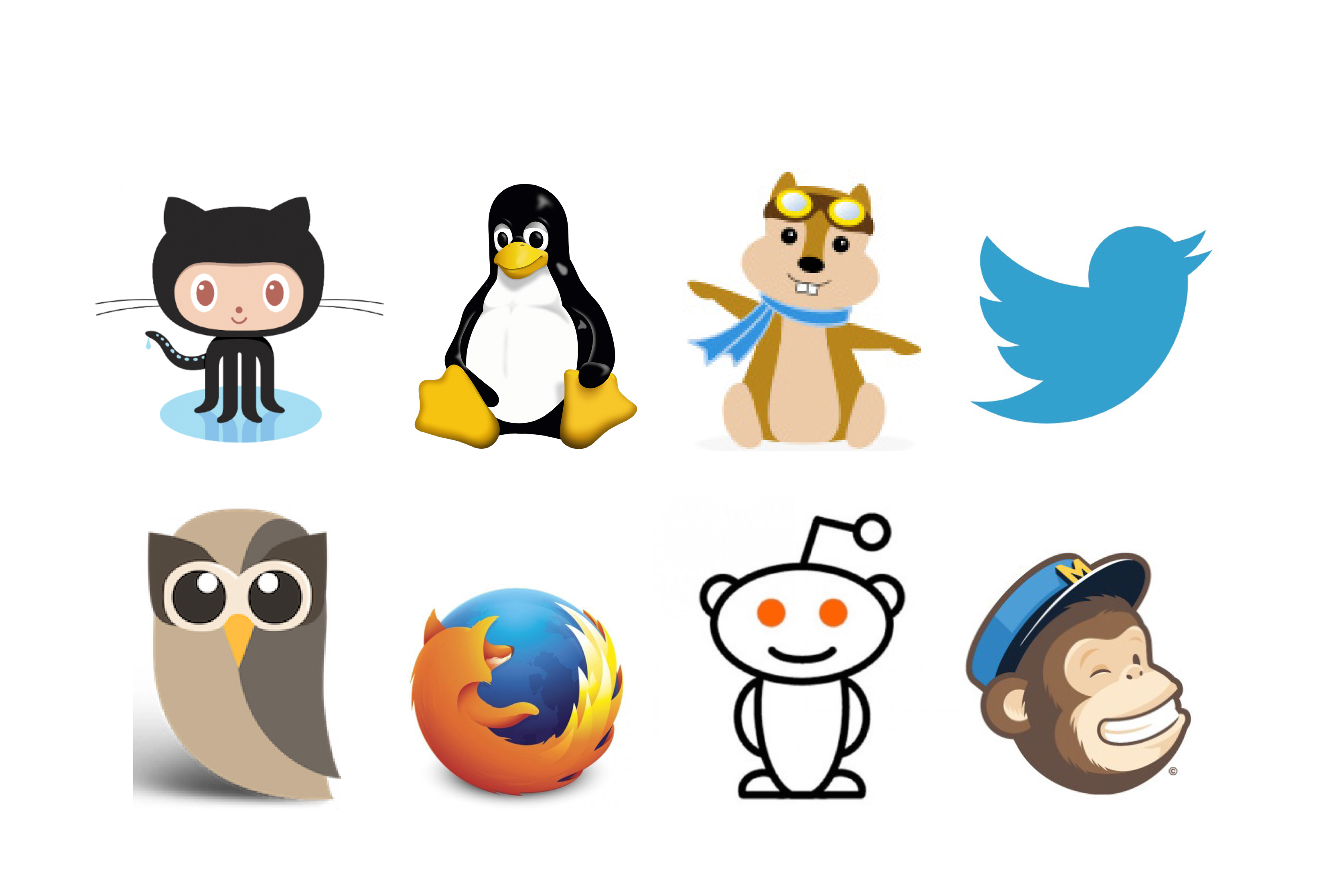 Examples of animals appearing in brand communication of "online" products and services. Image courtesy: GitHub, Linux, Hipmunk, Twitter, Hootsuite, Firefox, Reddit and MailChimp
 The hobby set radio receiver design by Dieter Rams and Jürgen Greubel, 1967. Photo: http://dasprogramm.co.uk/
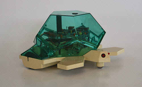
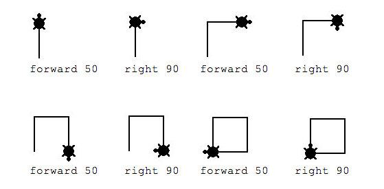
 Together with his colleagues Wally Feurzig and Cynthia Solomon, Papert developed LOGO, an educational dialect of the functional programming language Lisp, which was used to command firstly a virtual turtle, then a small turtle-shaped robot that could move and draw. © Logo Foundation
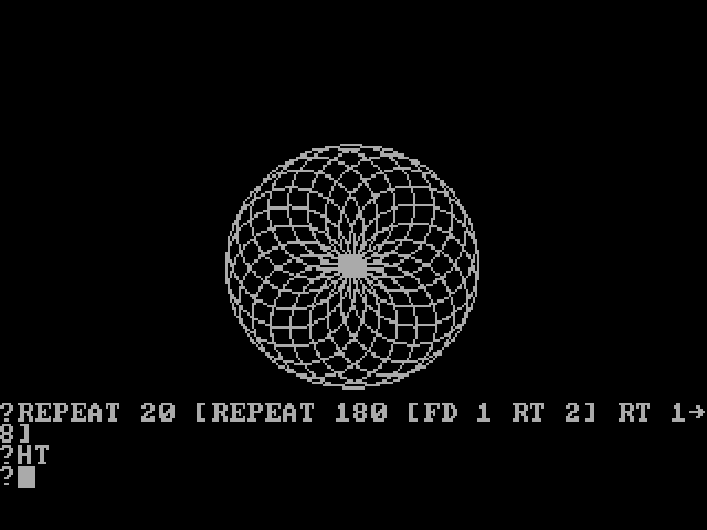
![Example Output of Logo (turtle graphic). Logo source code to create this graphic: to n_eck :ne :sz repeat :ne [rt 360 / :ne fd :sz] end to mn_eck :ne :sz repeat :ne [rt 360 / :ne n_eck :ne :sz] end Start Program with: mn_eck 36 20. Graphic created by wikipedia user remi](/site/assets/files/1049/remi_turtlegrafik.png) Example Output of Logo (turtle graphic). Logo source code to create this graphic: to n_eck :ne :sz repeat :ne [rt 360 / :ne fd :sz] end to mn_eck :ne :sz repeat :ne [rt 360 / :ne n_eck :ne :sz] end Start Program with: mn_eck 36 20. Graphic created by wikipedia user remi
Example Output of Logo (turtle graphic). Logo source code to create this graphic: to n_eck :ne :sz repeat :ne [rt 360 / :ne fd :sz] end to mn_eck :ne :sz repeat :ne [rt 360 / :ne n_eck :ne :sz] end Start Program with: mn_eck 36 20. Graphic created by wikipedia user remi
The shiny slick surfaces of our dark screens look innocent. They seem to be waiting quietly and patiently to be filled with ‘content’. But once loaded, design wars are ongoing – and the winning or losing of such a battle decides about what kind of user will be called into existence by the screen. In other words, ‘content’ is not only being used and consumed by the user. It calls specific types of users into being, while ignoring others. This became clear to me, when I looked into the shift from real to flat design ongoing for a book on ‘Post-Digital Aesthetics’, which turned into a longer essay about ‘The Force of Communication’ for the ‘Search for Media series in collaboration by the University of Minnesota & meson press.
The question that bothered me was: what kind of situation unfolds when technology communicates with us? I decided to explore this question in depths assisted by Louis Althusser’s interpellation theory, which is based on an act of communication; it is the act of communication which helps him to explain the works of ideology. From the perspective of design, Althusser’s notion of ideology is especially useful as it evolves around an interesting shift: While he analyses communication (or interpellation), he does not look at what is said or what can be said. Instead, Althusser focusses on the situation created when being addressed and the force of this address, so to speak the structural force happening in the moment of communication. Using the example of a policeman calling out to you on the street, he illustrates that communication situates (even appropriates) its participants by establishing a link between sender and receiver in the act of interpellation: It constitutes a subject. His description of this constitution has turned into a highly influential “theory of interpellation”, although it is less a “theory” but consists of just a few paragraphs. In those paragraphs, Althusser shows that a specific social role—in his words a “subject”—comes into being by “the practical telecommunication of hailings”. To illustrate how this “hailing” or “interpellation” functions in the context of ideology Althusser introduces an individual that turns around in response to a policeman shouting “Hey, you there!” to “answer” that call. And in exactly that moment, so Althusser, one becomes a subject relative to the ideology of law and crime. In other words, in that moment one experiences the social force of communication, which Althusser calls ideology: ‘ideology “acts” or “functions” in such a way that it “recruits” subjects [...], or “transforms” the individuals into subjects [ . . . ] by that very precise operation which I have called interpellation or hailing’.
The operation of interpellation Althusser describes here, creates a situation of recruitment by establishing a link between a sender and receiver. IN the digital age, this is still the case only that now it can be found in new and different forms of communication: Today, the recruiting of subjects happens when we are addressed by the interfaces of the technologies around us. By interacting with the interfaces of technology we are situated through this communication and recruited as specific subjects. But as what kind of subjects are we currently recruited? I decided to observe a range of examples with a focus on how something is communicating. As who are we being recruited when digital interfaces address us? In which situation do we find ourselves?
On 3 April 2010 Apple’s co-founder, chairman, and chief executive officer unveiled a tablet computer it introduced as “iPad”. Its new product was operated via a touch screen and could play music, take photos, shoot video, and perform Internet functions such as web-browsing and emailing; more applications, from games to social networking, could be added. In its first fiscal year following the launch of the new product range, Apple sold 32 million iPads with 140,000 apps being created for it by December 2011 (Economist 2011). By that time, screens had been technically refined so that their visual interfaces did not need to be operated via minimal black and white icons anymore. They could be replaced by touch screens with voluptuous 3D buttons more to the taste of Steve Jobs. As the former CEO of the animated film studio Pixar, he had a passion for reality imitating 3D graphics, as had Scott Forstall, the first architect of iOS, the software developed for the iPhone and iPad. Thus, the early iPads had many voluptuous 3D buttons and other skeuomorphic features mimicking an original: the Notepad app had a border of stitched leather to make it look like a real notebook, the Podcasts app displayed a reel-to-reel tape deck when one pressed play, and the calendar and contacts apps looked like small books and featured a page turn animation. Making apps and items mimicking their real-world counterparts gave the iPad a stuffy look and feel. Apple’s appeal to non-technical people, which had set a design paradigm, might have intentionally fostered childish playfulness by greeting users with a ‘Happy mac’, or using symbols like the ‘dogcow’ (indicating the setup of a page), the scissors (for the ‘cut command’), or the trashcan, all of them created by Susan Kare for earlier limited black and white screens. Now the computer had entered a new, advanced, but also more serious era—at least that was the impression Apple gave with the design of the first iPad. Its look and feel communicated to the user that computers had come of age, although not for very long. Technically, all screens from phone to tablets to laptops to PCs were able to display complex grown-up 3D interfaces. Still, a new and very different trend emerged that soon became more successful than mimetic skeuomorphism.
Surprisingly, the new trend was initiated by Apple’s rival Microsoft, who after the iPhone’s success had already been written off. Faced with the staggering success of Apple’s phone, Microsoft had to respond with an original and different approach: For their handheld devices, the Microsoft designers decided to focus on cards and not on buttons. Eager to avoid Apple’s extensive use of skeuomorphism (Wingfield 2012), their inspirations came from the design principles of classic Swiss graphic design, which favors a minimal style, emphasizes typography and uses a grid that can often be seen on European transportation signs. Instead of buttons, they used text placed on cards, which one could navigate laterally through scrolling canvases. Their typography-based design language came to be known as ‘Microsoft Design language’. Its principles had originally been developed for Microsoft’s mobile media player Zune (2006–2008), before they were taken over to the Windows phone, launched in 2010. Although the device did not have the same success as the iPhone, its design would inspire others, Google among them—and Google’s logo in fact exemplifies this new and different approach to user communication.
While Apple’s skeuomorphic design for the iPad communicated its device as a toy-tool for grown-ups, the ‘flat design’ Microsoft had initiated would go a very different way—and with it a new form of addressing the user would begin. Early on, Google would be part of this. On Wednesday 5 May 2010, the search engine Google changed its logo for the first time in ten years and 11 months (Googleblog 2010). The new logo was less skeuomorphic and more colorful. Its three-dimensional letters in red, yellow and blue, plus the green ‘l’ based on the font Catull lost their drop shadows. The logo had exchanged the rich details of skeuomorphism in their big typography with louder colors and more simple forms. Google’s senior user experience designer Wiley explained the change on the search engine’s blog as follows: “The new logo is lighter, brighter and simpler. We took the very best qualities of our design—personality and playfulness—and distilled them.” (Googleblog 2010). Experts agreed. Already before the change, British graphic designer Peter Saville, known for minimal design like the radio signal cover for Joy Division’s album “Unkown Pleasures”, described Google’s logo in an interview not just as playful. For him it was addressing children: “Everything about it is childlike: the colors, the typeface, even the name” (cited in Rawsthorn 2010).
The redesign intensified this further. Chris Moran, then The Guardian’s search engine editorial optimizer, commented on the new look and feel as a turn towards “My First Search Engine” (Moran 2010). Online, the rise of flat design had begun, even though it would take a while before its triumph over skeuomorphism became recognizable—it was not until 2013 that an animated webpage displayed the “battle flat design vs. realism” (Intacto 2013). Flat design opposed skeuomorphic and other “artificial” design techniques, in favor of two-dimensional, “flat” illustrations, big typography and bright colors for a more simplified aesthetic. When the new design became a mainstream trend, however, something else changed—technology would approach the user in a different way. The new design style addressed a very different user—not an adult one. Visually the style resembled books for very young children. Addressing the user as a very young child, however, was a transformation that did not happen abruptly and not just in one field. With hindsight, years before 2013 the new trend in brand design could have been spotted on the World Wide Web. And although it went for a long time unnoticed, it fundamentally changed how brands approached the user.
Contemporary brand communication generally has a double function: It enables the user to identify a product, and for this gives the product or service a specific identity or image (Millman 2012, Holt 2004). With the internet, as many marketing books were eager to explain (Levine et. al. 2000), brands had to become a conversation. But this was not the only novelty. Online the rules seemed to be different, which is why several internet companies embraced animals (or aliens). Or was it because they addressed someone very different? In any case, if one attentively observed the brand communication of ‘online’ products and services, one could notice that animals had peacefully appeared in large numbers. Next to the fox of the web browser Firefox chirped the blue bird of the microblogging service Twitter, while a little white alien with antenna accompanied Reddit, the social networking service that provided online conversations for “digital natives” as they were dubbed. And not only platforms, but also technology companies seemed to have a thing for mascots, from Tux, the penguin of the Linux operating system to the black Octocat that had landed on the 404 pages of Github, the web-based hosting service for software development projects. And there were many more, like the bare-bellied chimpanzee with a postman’s hat, who helped create professional email for MailChimp, or the big-eyed brown owl, which had become part of the logo of Hootsuite, a social media management dashboard, or the flying beaver, which sat enthroned on the online travel page of a start-up company called Hipmunk. Even a non-mascot service like facebook introduced a character, the Zuckasaurus, which looks “like a short Barney, the kid’s television show dinosaur” (Bilton 2014). Standing on its two feet while checking his laptop, the blue dragon-like dinosaur was first spotted in April 2014, when it started to address users in a pop-up window with the educational concern that it “just wants to make sure you’re sharing this post with the right people”. In short, animated animals could be found all over the World Wide Web as if it were a fairy tale. Mascots had spread from sports, where they were supposed to bring luck to a team, to the internet, and academic books started to analyze the phenomenon (Brown and Ponsonby-McCabe 2014). In the offline world, brands, which were targeting their products to adults, were generally refrained from using mascots; companies that produce cars, alcohol, or even entertainment electronics rarely considered an animated animal as part of their brand strategy.
Parallel to the appearance of the online-mascots, a similar development could be found on search pages: the rise of the Google Doodle’s, which introduced a new unique style of commemoration that shared the same tendency. Until 2010, Google had only sporadically changed its prominent search website logo into those “Doodles” in order to mark an anniversary or event. Although the concept of the Doodle was born at the very start of the company (1998), when founders Larry Page and Sergey Brin changed the logo with a stick figure drawing to mark their visit of the Burning Man festival in the Nevada desert, the logo was not changed very often. It took two years before they requested a second change to honor Bastille Day commemorating the beginning of the French Revolution each year on the 14th of July. Before 2010, the logo was changed only on rare occasions. Then one could find a sketch that playfully intertwined the topic of an event with the logo: the birthday of English mathematician Ada Lovelace, Martin Luther King Jr. Day or Halloween. After 2010 the frequency with which Doodles replacing the logo intensified. In 2010, Google published 35 Google Doodles, more than in any previous year. In the years 2011 and 2012, this number went up to 76 and 83, and has gone up ever since. More and more Doodles displayed events, or presented persons shaping human history and culture with imaginative cuteness. Worldwide they started to appear thereby taking national cultures into account: Britain celebrated the 800th anniversary of the Magna Carta (2015), Mexico the Day of the Death (2013) and the United States celebrated the Mexican Hollywood actress Katy Jurado (2018).
Considering that Google is now an essential part of our public sphere—the Court of Justice of the European Union (2014) indicated this by its ruling that natural persons have the right to be forgotten and links to personal data must be erased in this public space—Google Doodles are the monuments we find in it. As we pass by those monuments when searching, we are reminded of important moments that shaped our human fate. This form of commemoration, however, happens in a rather unique way, different from historic monuments cast in stone and erected on our public squares, which foster a certain symbolism and spread an air of pathos. Indeed, most public monuments in stone or bronze are slightly pathetic, from the Statue of Liberty enlightening the world from Liberty Island (Manhattan) to the Soviet War Memorial in Berlin (Treptower Park) to the Monument of the People’s Heroes in Beijing (Tiananmen Square) to Christ the Redeemer in Rio de Janeiro (on the Corcovado mountain). Online Doodle monuments, on the other hand, turn achievements into playful stories with imaginative cuteness and are supposed to be “fun” (Google Doodles Archive 2018). It should come as no surprise that they more often commemorate birthdays than deaths.
Before judging Google Doodles as ‘history light’, however, it is important to take a step back and get a full view of the transformation. Certainly all three developments—the rises of flat design, brand mascots, and Google Doodles—show a common tendency as their style is equally defined by colorful surfaces, big typography, and playful stories or mascots, thereby resembling elements we are familiar with from children’s books or apps. Thus, what is the specific form of interpellation that can be noticed here? How is technology addressing us? To state the obvious: online, technology has started to address us as if we were children. The extend of this infantilization, however, only fully comes into view when comparing the above described design tendency to an older project designed by Dieter Rams, who helped the company Braun to relaunch an educational toy called ‘Lectron’; and like many of his other designs it became iconic.
Lectron was a modular electronic experimentation kit designed to introduce youth to basic electronic circuits and theory. From 1967 on, the German designer and his team produced the packaging in a new style including a redesign of all manuals. Being supervised by Rams, it is not very surprising that the Braun Lectron Hobby Set Radio Receiver (1969) is kept in a minimal style. Contrary to the users of Google’s search engine, Apple’s iPad, or the service online brands, however, it does not target adult users. As a game it is tailored to a much younger age group. So how does Lectron approach its teenage user?
The cardboard box cover shows three photographs. Two smaller ones display the white radio set in Rams’s minimal design and a detail of a printed circuit board; the bigger photo pictures a black haired teenager in a buttoned up blue shirt, who sits in front of components and tools soldering electric parts. Lectron approaches the technically interested and capable teenager. Contemporary flat design, on the other hand, incorporates design elements for a much younger age group. Its colorful surfaces, big typography and animated characters are generally design elements used for targeting children aged two to seven—a time in which children are in the sensorimotor stage. Children in this stage, as the child psychologist Jean Piaget has shown, assign active roles to things in their environment (animism), while their activities are mainly categorized by symbolic play and manipulating symbols. It is a stage in which physical operations are more dominant than mere “mental” operations. Thus, the conclusion is obvious: we are addressed by technology as very young children.
Fighting back the natural reaction to all miscategorizations (feeling insulted), this is an interesting outcome to be investigated further by shifting our attention back to the aspect Althusser had in mind when discussing being addressed as a form of power. So what is the effect of this infantilization of user interfaces? What force or form of power play are we facing here? For that we face a form of power play can almost be taken for granted—when technology is communicating with us in this way, it is surely not just transmitting the friendliness of cuddly Silicon Valley companies that commissioned plush-toy-like interfaces to comfort us in the exhausting world we live in.
In this world, technology is not neutral—its force is that it confronts us through its interface with a specific situation or a specific transformation. To say it with Donna Haraway: “We’re living in a world of connections—and it matters which ones get made and unmade.” (cited in Kunzru 1997) To explore the effect of infantilization further, I will now turn to an advertisement of the company that created the style of flat design: Microsoft.
In 2014 Microsoft aired its first national Super Bowl advertisement, a one-minute video produced mainly inhouse. Using Microsoft products, it explores technology through the eyes of Steve Gleason, a former NFL player who is battling ASL, a severe illness, which attacks nerve cells in the brain and spinal cord that control muscle movement. At the beginning of the video, we hear a computer-generated voice asking: “What is technology?” and see it being written by Steve Gleason, who sits in a wheelchair with a keyboard he operates via eye movement. We see a girl playing with a red windmill. From there, the commercial cuts to symbols that resemble written code followed by Microsoft’s colorful card screen design. Then a surgeon is flipping through large medical images displayed on a wall using his hand gestures; followed by a white toy robot, which is about to look at us as the camera movement suggests. Steve’s next question can be seen and heard: “What can it do?”, after which a small boy enters the screen playing baseball standing on two artificial legs, followed by the 98-year-old painter Hal Lasko, partially blind, painting a colorful landscape with the help of a mouse. Again, Steve Gleason’s artificial voice is asking: “How far can we go?” We see pictures of a satellite in the universe, a surgeon using his hand to control an X-Ray, and two groups of children cheering each other via a video-chat projection. After this introductory period, the next thirty seconds are grouped around a theme showing the examples of the “power” of technology, as Gleason puts it. A soldier being remotely present during the birth of his child. A small child freaking out with joy when it sees her dad on the screen. Several scientific and medical successes, from the launch of a rocket to a man with an artificial arm moving his hand, and the emotional reaction of a woman making remote contact with someone on the other side of the screen. It ends with the slogan “It has given voice to the voiceless” showing Gleason in his high-technology wheelchair, a computer helping him communicate, his son on his lab to which he now connects directly by raising his eyebrows. The main slogan appears: “Empowering us all” being replaced after a few seconds by the logo of Microsoft.
The commercial is informed by the topic that frames it: How technology helps—“empowers”—those we love and care for leading a better life and certainly appeals to our emotions. The majority of the situations depicted in this video are related to health and science. Thus the situations visualized mainly pertain to health or science—generally areas not dominated by children. The video, however, uses nearly as many images of children (as individuals and in groups) as adults. A content analysis (i) shows nine sequences with the focus on children and twelve with the focus on adults. The reason for images of curious, excited and playful children lies partly in the task of every commercial: to create appealing images. But there is more to it. That children are playfully discovering technology is also symbolic. This becomes apparent when Gleason’s first question opening the video “What is technology?” is followed by a sequence showing a small girl in a dress curiously looking at the windmill she puts into motion with her small hand: humans exploring technology. The message of a girl putting a windmill into play (its move enhanced by a sound effect) is visually answering this question. Moving a windmill means exploring technology. The usage itself is an act of exploration—and empowering.
Of course, one can argue that this is a message in the interest of Microsoft: The sheer usage of its commercial products is empowering—and not programming code yourself, as for example open source software would allow. Being able to understand or even program code yourself can certainly be more empowering. Still, this does not fully explain why the question “What is technology?” finds a fitting visual sequence in a child playing with a windmill. Instead of asking what a windmill has to do with digital media or Microsoft, the sequence makes sense. Linking this image to theories of learning and its role for the history of graphic user interfaces, the last section aims to explain why this could be the case.
The graphical user interface has become the commercial success today through several experiments, among them Douglas Engelbart’s NLS system, Ivan Sutherland’s Sketchpad, SGI’s Iris, the two interfaces of the Xerox Alto and Xerox Star, and the Apple Lisa and Apple Macintosh. As such, it is generally referred to as the transformation that helped personal computers to become mainstream (for example Chun 2011). Its advantage: It is easier to use than a command line interface. Therefore the graphic interface appeals to users not familiar with coding. This part aims to inquire what it is that makes it easier, and how this is linked to the girl playing with a windmill. To show this, it is first necessary to compare the older command line interface with the newer graphical user interface with respect to learning. In principle, both interfaces have the same function: They are ways to command a program. How they approach the user, however, is different. The commands for a command line interface must be known by the user beforehand, while a visual interface is generally self-explanatory, much like a videogame. Its windows, icons, menus and the pointer are intuitive elements, while the knowledge to operate the command line needs to be learned beforehand. This is not necessary with a graphical user interface that can be operated without much knowledge as it incorporates the learning into its usage. Learning theories in fact played an important role in its development. Discussing the work of mathematician Seymour Papert, who worked closely with child psychologist Jean Piaget and has influenced the computer scientist Alan Kay, the following section will take a look at the connection of learning theories to computer science in general and the graphical user interface in particular.
When developing new approaches to artificial intelligence, Papert had come across theories of learning by child psychologist Jean Piaget. The South African had met Piaget when he spent time in Paris as part of his second doctorate in St. John’s College in Cambridge, and decided to follow him to his Institute in Geneva to apply his theories to artificial intelligence, a field that found itself in its ‘golden years’ from 1956 to 1974 driven by new discoveries and funding. More precisely, Papert’s aim was to enhance machine learning by incorporating Piaget’s ideas of the learning of children, although their interest was mutual: Piaget endorsed Papert’s cybernetic approach and published many of his articles in his journal Études d’Épistemologie Génétique. Known today as a child psychologist, he understood himself as a scholar of epistemology exploring theories of knowledge with the aim to establish a new approach towards understanding. And it would be the graphical user interface that would pick up this approach to show that the learning of children can indeed be applied to the learning of adults, too.
Interested in multiple ways of knowing, Piaget turned to children’s learning as a unique form of interacting and theorizing. Curious about their thinking, he took their logical reasoning seriously, even when their thinking led to ‘wrong’ answers. His nonjudgmental approach enabled him to describe four universal stages of cognitive development that are still relevant to contemporary psychology. More importantly in the context of this argument, however, is something different: Central to his approach was the hypothesis that for human understanding and learning the act of reasoning (the work of the mind) is as important as practical or experimental understanding (the work of the fingers and mind together). When observing children between the ages of two and seven (which is as what we are addressed at the moment), Piaget had recognized a specific way in which children play. He saw in children’s sensorimotor approach a form of learning—thinking with fingers—which is most important when we are very young children. From this, he concluded that logic is not only formed in the brain:
I believe that logic is not a derivative of language. The source of logic is much more profound. It is the total coordination of actions, actions of joining things together, or ordering things, etc. This is what logical-mathematical experience is. (Piaget 1972,13, see also 1969, 90)
Piaget developed what has come to be known as constructivism, an approach that viewed learning rather as a reconstruction than as a transmission of knowledge. It valued experience highly and understood playing—the manipulating of materials—as a way to create knowledge.
To know an object, to know an event, is not simply to make a mental copy, or image, of it. To know an object is to act on it. To know is to modify, to transform the object, and to understand the process of this transformation, and as a consequence to understand the way the object is constructed. (...) In other words, it is a set of actions modifying the object, and enabling the knower to get at the structures of the transformation. (Piaget 1972, 20)
To apply and automate this approach to machine learning, Seymour Papert (1963) developed a project called “genetron”, which explored the learning of algorithms by allowing them to build their own network topologies that simulated qualitative and quantitative developmental change (Shultz et.al. 2008; Minsky and Papert 1969). He was later assisted by Marvin Minsky, with whom he co-founded MIT’s Artificial Intelligence Lab. Despite support from MIT, the project struggled with technical limitations (Shultz et. al. 2008). But Papert had also started to approach the relation of child and machine through another angle, manipulating not the machine’s learning but children’s learning. Applying Piaget’s theory, the aim here was to allow a coordination of actions—acting with an object—to initiate learning in children: learning to operate a computer. Together with his colleagues Wally Feurzig and Cynthia Solomon, Papert developed LOGO, an educational dialect of the functional programming language Lisp, which was used to command firstly a virtual turtle, then a small turtle-shaped robot that could move and draw. And it was this approach that would inspire Papert’s colleague Alan Kay to develop a graphical user interface not just for children but also for “children of all ages” (Kay 1972).
When he met Papert, Alan Kay was a young, creative computer scientist who had thought about the graphical user interface ever since he was a student—the first thing his supervisor gave him to read was Ivan Sutherland’s description of the “Sketchpad”, one of the first interactive computer-graphics programs. But it was watching children in schools using Papert’s LOGO that enabled a breakthrough:
Here were children doing real programming with a specially designed language and environment. ( . . . ) this encounter finally hit me with what the destiny of personal computing really was going to be. Not a personal dynamic vehicle, as in Engelbart’s metaphor opposed to the IBM “railroads”, but something much more profound: a personal dynamic medium. With a vehicle one could wait until high school and give “drivers ed”, but if it was a medium, it had to extend into the world of childhood. (emphasis added; Kay 1996, 523).
Kay understood that the logic of the world of childhood could be extended to adults by re-applying visual thinking to an adult interface. Reading (besides Piaget) the educationalists Jerome Bruner and Maria Montessori had convinced him that not the command line but visual thinking and a more iconic approach (531–532) would shape future ways of operating a computer. His insights culminated in his proposal “A Personal Computer for Children of All Ages” (Kay 1972), which described a portable educational computer to be commanded by experimental actions. It was based on a program that came to be known as Smalltalk, a program “environment in which users learn by doing” (547). Via Papert, Piaget’s insight that logic can be a coordination of actions, had found its way to Kay’s interface, who saw Piaget’s thesis confirmed: “Just doing seems to help.” (547)—a seismic shift. With the graphic user interface, experimental thinking started to assist linguistic thinking. And with the rise of digital media, interfaces have become the way we approach information, an approach based on experimental as much as on linguistic logic. Relying on a logic we use in Western culture primarily when we are very young, interfaces address us as very young children. Users of graphical interfaces are asked to apply an experimental logic, which means to learn to understand the interface via a set of actions. Ever since the rise of digital media, the devices that inhabit our kitchens or gardens have stopped asking us to read through the manual before being switched on for the first time.
The infantilization of interfaces does not necessarily mean that technology is becoming smart while we are declared stupid. Reaching out to a human logic mostly used in childhood similar to the way Kay’s and Papert’s interfaces functioned, the playful addressing of the user can also be read as an invitation to experiment. In experimenting, in playing with the windmill, we use digital technology. Using it, however, means to understand how to act on it—acquire the skill to use its force—thereby entering into a dialogue with that technology.
NOTES
(i) The analysis did not count individuals. Every time a new or a different sequence was introduced, it looked if the focus was on ‘adult’ or ‘child’, whereby groups counted the same as individuals. Three scenes were mixed. When the child plays football surrounded by a group of adults, the focus is mainly on the child (counted as child). The childbirth in the surgery theatre shows first adults at work; from there the camera moves to the child that was just born (counted as adult and child). The last scene shows Steve Gleason looking at the son on his lab (counted as adult and child).
REFERENCES
Althusser, Louis. 2014. On the reproduction of capitalism: Ideology and ideological state apparatuses. London: Verso Books.
Bilton, Nick. 2014. “Facebook’s New Privacy Mascot: The Zuckasaurus.” The New York Times. 23.5.2014, B1. Accessed 10 April 2018 http://bits.blogs.nytimes.com/2014/05/22/a-blue-dinosaur-becomes-a-facebook-ambassador-for-1–28-billion-people/.
Chun, Wendy Hui Kyong. 2011. Programmed visions: Software and memory. Cambridge, MA: MIT Press.
Court of Justice of the European Union (2014) Judgment in Case C-131/12 Google Spain SL, Google Inc. v Agenda Espanola de Protecci6n de Datos, Mario Costeja Gonzalez. Press Release No. 70/14. Luxembourg: 13 May 2014.
Economist. 2011. “Difference Engine: The iPad's Third Coming.” December 2. https://www.economist.com/babbage/2011/12/02/difference-engine-the-ipads-third-coming.
Google Doodles Archive 2018 https://www.google.com/doodles/about
Googleblog. 2010, May 5. “The Google design, turned up a notch.” Accessed 10 April 2018. https://googleblog.blogspot.co.uk/2010/05/google-design-turned-up-notch.html.
Holt, Douglas. 2004. How Brands Become Icons: The Principles of Cultural Branding. Boston: Harvard Business School Press.
Intacto. 2013. Accessed 10 April 2018. http://www.flatvsrealism.com/.
Kay, Alan. 1972, August. “A Personal Computer for Children of all Ages”—Conference Paper. Proceedings of the ACM National Conference, Boston.
Kay, Alan. 1996, January. “The early history of Smalltalk.” In History of programming languages—-II, edited by Bergin, Thomas J., and Richard G. Gibson, 511–598. New York: ACM Press, 1996.
Kunzru, Hari. 1997. “You are cyborg.” Wired Magazine 5.2, 1–7. Accessed 10 April 2018. http://www.wired.com/1997/02/ffharaway/.
Levine, Rick, Locke, Christopher, Searles, David and David Weinberger. 2000. The Cluetrain Manifesto: The end of business as usual. New York: Basic Books.
Minsky, Marvin and Seymour Papert. 1969. Perceptrons: An Introduction to Computational Geometry. Cambridge, MA: MIT.
Millman, Debbie. 2012. Brand Bible: The Complete Guide to Building, Designing, and Sustaining Brands. Beverly, MA: Rockport.
Moran, Chris. 2010. Discussion of the New Google Logo. (Personal communication, 6 May 2010.)
Papert, Seymour. 1963. “Etudes comparee de l’intelligence chez l’enfant et che le robot.” Léo Apostel, Jean Blaise Grize, Seymour Papert, Jean Piaget, La Filiation des structures. Études d’Épistemologie Génétique, XV, 131–194. Paris: PUF.
Papert, Seymour, with Guy Cellérier and Gilbert Voyat. 1968. Cybernétique et Épistémologie. Études d’Épistemologie Génétique, XXII. Paris: PUF.
Piaget, Jean and Bäbel Inhelder. 1969. The Psychology of the Child. London: Routledge & Kegan Paul.
Piaget, Jean. 1972. Development and Learning. In "Piaget Rediscovered" edited by Richard Ripple and Verne Rockcastle, 7–20. Ithaca, NY: Cornell University.
Rawsthorn, A. (2010, March 14) “Google’s Doodles,” The New York Times. Accessed 10 April 2018. www.nytimes.com/2010/03/14/t-magazine/02talk-rawsthorn.html.
Shultz, Thomas R. and William C. Schmidt, David Buckingham, Denis Mareschal. 2008. Modeling Cognitive Development With a Generative Connectionist Algorithm. "Developing Cognitive Competence: New Approaches to Process" Modeling edited by Tony J. Simon, Graeme S. Halford, 205–261. Hove: Lawrence Erlbaum.
Wingfield, Nick (2012, August 3) “Microsoft Drops Metro Name for New Product Look”, The New York Times. Accessed 10 April 2018. http://bits.blogs.nytimes.com/2012/08/03/microsoft-drops-metro-name-for-new-product-look.